
Asteroid Fury
Note: This footage has been cut and edited for a streamlined viewing to explore the gameplay.
Solo Project (3 Months)
Google Play store link: Asteroid Fury
Itch.io link: Asteroid Fury Itch.io
Overview: Asteroid Fury is an arcade mobile game, the aim of the game is to rotate a paddle around the planet deflecting asteroids and using power ups to your advantage.
Aim: The aim of this project was to target the arcade hardcore/casual player base, implement unity ads for the first time, improve UX/UI design while releasing an app to the play store.
Case Study
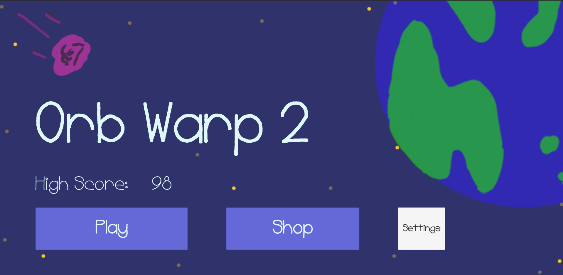
UX/UI Problem: I previously released another mobile game with a similar theme and art style, that game was called “Orb Warp”. Coming into the development of Asteroid Fury (Originally called “Orb Warp 2”) I fell into the trap of basing my initial prototypes art style off this previous game.
Below are screenshots of initial prototype.

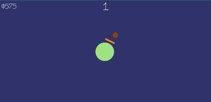
Regarding both of these screenshots they contained flat colours which made reading the main menu and gameplay elements difficult.
While within the Main Menu (Left Image) the buttons didn’t explain anything to non-English speakers/readers, as they weren’t recognizable due to a lack of icons.
UX/UI Solution: After identifying the problem I explored contrasting colours and researched into creating readable UI and gameplay elements.
The below in-game screenshots and gif comparisons (prototype vs final product) contain a small explanation underneath each image regarding the problem and solution.
Problem: Buttons aren’t readable to non-English speakers/readers, colours are flat and Font spacing isn’t wide enough.

Solution: Buttons have Icons resembling where they navigate, Font is digestible with it’s spacing, Colours are contrasting.

Problem: Flat colours, gameplay elements disappear into the background causing difficulty in visually reading the game.
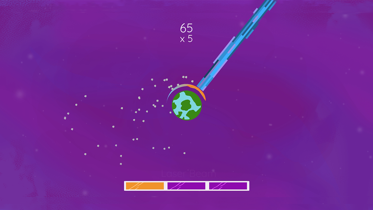
Solution: Contrasting Colours, gameplay elements are easier to visually digest and identify what’s going on.
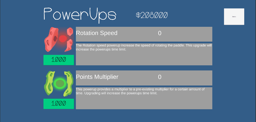
Problem: Too much text, colours were flat and jarringly inconsistent, didn’t explain level of the upgrades.
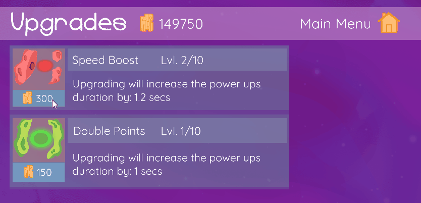
Solution: Tightening up the necessary text, contrasting colours, shown level of upgrade, home icon added for Main Menu.
UX/UI Results:
I wouldn’t say the end result is amazing but it did become a more user friendly experience after exploring contrasting colours and readable 2D icon/gameplay elements.
Going forward into future projects I’ll be focusing on how I can produce readability through colours and icons before using text where necessary.
Overall:
What went well:
I accomplished the aim of the project that I had set out to complete
Finished the game within the set time frame I intended (this required relaxing my expectations on what I could achieve by myself)
Learnt better workflows for implementing 2d art assets, audio and code structures.
Strengthened my knowledge of Photoshop and Unity.
Future Improvements:
Future projects I plan to include a lot more time for polishing, exploring UI and economy progression early on in the designs.
I need to think about marketing/growing a audience, rather then waiting for once the game is released.
Above point includes forming better habits of sharing work in progress, or interesting work I’ve done.